
[fusion_builder_container type=”flex” hundred_percent=”no” hundred_percent_height=”no” hundred_percent_height_scroll=”no” align_content=”stretch” flex_align_items=”flex-start” flex_justify_content=”flex-start” flex_wrap=”wrap” hundred_percent_height_center_content=”yes” equal_height_columns=”no” container_tag=”div” hide_on_mobile=”small-visibility,medium-visibility,large-visibility” status=”published” border_style=”solid” box_shadow=”no” box_shadow_blur=”0″ box_shadow_spread=”0″ gradient_start_position=”0″ gradient_end_position=”100″ gradient_type=”linear” radial_direction=”center center” linear_angle=”180″ background_position=”center center” background_repeat=”no-repeat” fade=”no” background_parallax=”none” enable_mobile=”no” parallax_speed=”0.3″ background_blend_mode=”none” background_slider_skip_lazy_loading=”no” background_slider_loop=”yes” background_slider_pause_on_hover=”no” background_slider_slideshow_speed=”5000″ background_slider_animation=”fade” background_slider_direction=”up” background_slider_animation_speed=”800″ video_aspect_ratio=”16:9″ video_loop=”yes” video_mute=”yes” pattern_bg=”none” pattern_bg_style=”default” pattern_bg_opacity=”100″ pattern_bg_blend_mode=”normal” mask_bg=”none” mask_bg_style=”default” mask_bg_opacity=”100″ mask_bg_transform=”left” mask_bg_blend_mode=”normal” absolute=”off” absolute_devices=”small,medium,large” sticky=”off” sticky_devices=”small-visibility,medium-visibility,large-visibility” sticky_transition_offset=”0″ scroll_offset=”0″ animation_direction=”left” animation_speed=”0.3″ animation_delay=”0″ filter_hue=”0″ filter_saturation=”100″ filter_brightness=”100″ filter_contrast=”100″ filter_invert=”0″ filter_sepia=”0″ filter_opacity=”100″ filter_blur=”0″ filter_hue_hover=”0″ filter_saturation_hover=”100″ filter_brightness_hover=”100″ filter_contrast_hover=”100″ filter_invert_hover=”0″ filter_sepia_hover=”0″ filter_opacity_hover=”100″ filter_blur_hover=”0″][fusion_builder_row][fusion_builder_column type=”1_1″ layout=”1_1″ align_self=”auto” content_layout=”column” align_content=”flex-start” valign_content=”flex-start” content_wrap=”wrap” center_content=”no” column_tag=”div” target=”_self” hide_on_mobile=”small-visibility,medium-visibility,large-visibility” sticky_display=”normal,sticky” order_medium=”0″ order_small=”0″ hover_type=”none” border_style=”solid” box_shadow=”no” box_shadow_blur=”0″ box_shadow_spread=”0″ background_type=”single” gradient_start_position=”0″ gradient_end_position=”100″ gradient_type=”linear” radial_direction=”center center” linear_angle=”180″ lazy_load=”avada” background_position=”left top” background_repeat=”no-repeat” background_blend_mode=”none” background_slider_skip_lazy_loading=”no” background_slider_loop=”yes” background_slider_pause_on_hover=”no” background_slider_slideshow_speed=”5000″ background_slider_animation=”fade” background_slider_direction=”up” background_slider_animation_speed=”800″ sticky=”off” sticky_devices=”small-visibility,medium-visibility,large-visibility” absolute=”off” filter_type=”regular” filter_hover_element=”self” filter_hue=”0″ filter_saturation=”100″ filter_brightness=”100″ filter_contrast=”100″ filter_invert=”0″ filter_sepia=”0″ filter_opacity=”100″ filter_blur=”0″ filter_hue_hover=”0″ filter_saturation_hover=”100″ filter_brightness_hover=”100″ filter_contrast_hover=”100″ filter_invert_hover=”0″ filter_sepia_hover=”0″ filter_opacity_hover=”100″ filter_blur_hover=”0″ transform_type=”regular” transform_hover_element=”self” transform_scale_x=”1″ transform_scale_y=”1″ transform_translate_x=”0″ transform_translate_y=”0″ transform_rotate=”0″ transform_skew_x=”0″ transform_skew_y=”0″ transform_scale_x_hover=”1″ transform_scale_y_hover=”1″ transform_translate_x_hover=”0″ transform_translate_y_hover=”0″ transform_rotate_hover=”0″ transform_skew_x_hover=”0″ transform_skew_y_hover=”0″ transition_duration=”300″ transition_easing=”ease” scroll_motion_devices=”small-visibility,medium-visibility,large-visibility” animation_direction=”left” animation_speed=”0.3″ animation_delay=”0″ last=”true” border_position=”all” first=”true” min_height=”” link=””][fusion_text columns=”” column_min_width=”” column_spacing=”” rule_style=”” rule_size=”” rule_color=”” hue=”” saturation=”” lightness=”” alpha=”” user_select=”” awb-switch-editor-focus=”” content_alignment_medium=”” content_alignment_small=”” content_alignment=”” disable_idd=”no” hide_on_mobile=”small-visibility,medium-visibility,large-visibility” sticky_display=”normal,sticky” class=”” id=”” html_attributes=”W10=” width_medium=”” width_small=”” width=”” min_width_medium=”” min_width_small=”” min_width=”” max_width_medium=”” max_width_small=”” max_width=”” margin_top_medium=”” margin_right_medium=”” margin_bottom_medium=”” margin_left_medium=”” margin_top_small=”” margin_right_small=”” margin_bottom_small=”” margin_left_small=”” margin_top=”” margin_right=”” margin_bottom=”” margin_left=”” fusion_font_family_text_font=”” fusion_font_variant_text_font=”” font_size=”” line_height=”” letter_spacing=”” text_transform=”” text_color=”” render_logics=”” logics=”” animation_type=”” animation_direction=”left” animation_color=”” animation_speed=”0.3″ animation_delay=”0″ animation_offset=””]
Childcare website conversion optimization is essential for turning online interest into real inquiries, tours, and enrollments. A well-designed website should do more than share basic information. It must guide parents through a clear journey from initial visit to taking the next step with your center.
Strategic use of layout, messaging, calls to action, and trust signals can significantly increase the number of visitors who contact you or schedule a tour. By focusing on parent-friendly design, streamlined forms, and data-driven improvements, childcare centers can transform their websites into consistent, reliable enrollment engines.
Build A Daycare Landing Page Strategy That Guides Parents To Take Action

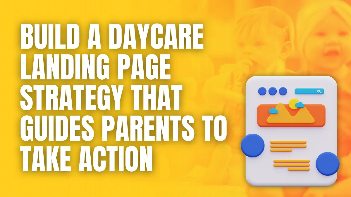
An effective daycare landing page strategy focuses on clarity, reassurance, and a clear next step for parents. Each page should be designed to support one primary goal, such as booking a tour or submitting an inquiry, while removing distractions that compete with that action.
Define One Primary Goal For Each Landing Page
Many childcare websites attempt to serve too many purposes on a single page. A focused landing page should have one main objective, for example:
- Schedule a tour
- Request more information
- Join a waitlist
- Claim a limited-time offer
The design, copy, images, and calls to action should all support this single goal. This approach lowers confusion and increases the likelihood that parents will complete the intended action.
Structure Content Around The Parent Journey
Parents visiting a daycare landing page are usually seeking quick answers to specific questions. A clear structure helps guide them from interest to action. A proven layout often includes:
- A concise headline that states the core benefit
- A short supporting paragraph that explains who you serve and what makes the center different
- Bullet points that highlight key advantages such as safety, curriculum, hours, or staff qualifications
- Visuals that show classrooms, teachers, and children engaged in learning
Place the primary call-to-action button near the top, then repeat it at logical points lower on the page so parents can act when they are ready.
Use Clear, Action-Oriented Calls To Action
Calls to action should be specific, easy to understand, and low-friction for parents. Examples include:
- “Schedule Your Tour”
- “Request Enrollment Information”
- “Check Current Openings”
Avoid vague phrases such as “Learn More” when the goal is to secure a tour or inquiry. Make sure buttons are visually prominent, mobile-friendly, and linked to a short, simple form.
Remove Barriers And Distractions
A strong daycare landing page strategy reduces unnecessary links and elements that distract from the primary goal. Limit navigation options, avoid long blocks of text, and ensure forms ask only for essential information. By keeping the path to action straightforward, the page supports higher conversion rates and more qualified inquiries for the center.
Improve Preschool Inquiry Form Design For Higher Completion Rates
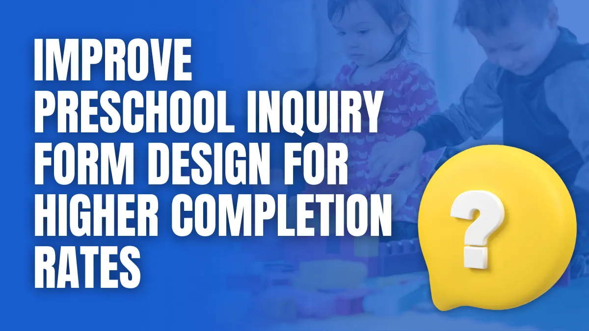
Effective preschool inquiry form design plays a direct role in how many website visitors turn into real leads. A clear, simple, and parent-friendly form removes friction and makes it easy for families to take the next step with your center.
Keep The Form Short And Focused
Parents often fill out forms on their phones between tasks or outside business hours. Ask only for information that is essential for initial follow-up, such as:
- Parent name and preferred contact details
- Child’s name and age
- Preferred location or program
- Preferred start date
Additional details can be collected later by phone or email. Shorter forms feel less overwhelming and are far more likely to be completed.
Use Clear Labels And Logical Grouping
A good preschool inquiry form design uses plain language and a logical structure. Group related fields together under headings such as “Parent Information” and “Child Information.” Avoid jargon and internal terms. Use:
- Clear labels above each field
- Simple dropdowns for age groups and locations
- Optional text fields for questions or comments
This structure helps parents understand exactly what is being asked and reduces errors.
Optimize For Mobile And Accessibility
Most parents will encounter your form on a mobile device. Ensure the layout is responsive, fields are large enough to tap easily, and the form scrolls smoothly. Additional best practices include:
- Single column layout for easy vertical scrolling
- Auto formatting for phone and email fields
- Contrast and font sizes that are easy to read
Accessible forms support all families and reflect a professional, inclusive brand.
Reassure Parents And Clarify Next Steps
Parents are more likely to complete the form when they know what will happen next. Near the submit button, include a brief line such as:
- “A team member will contact you within one business day.”
You can also add a short privacy note that confirms their information will be used only for admission or enrollment purposes.
Make Submission And Confirmation Simple
Use a clear call to action such as “Submit Inquiry” or “Request More Information.” After submission, display a confirmation message and send an automatic email receipt. This reinforces trust and assures parents that their inquiry has been received, which supports higher completion and engagement rates.
Strengthen Childcare Website Lead Generation With Clear Calls To Action
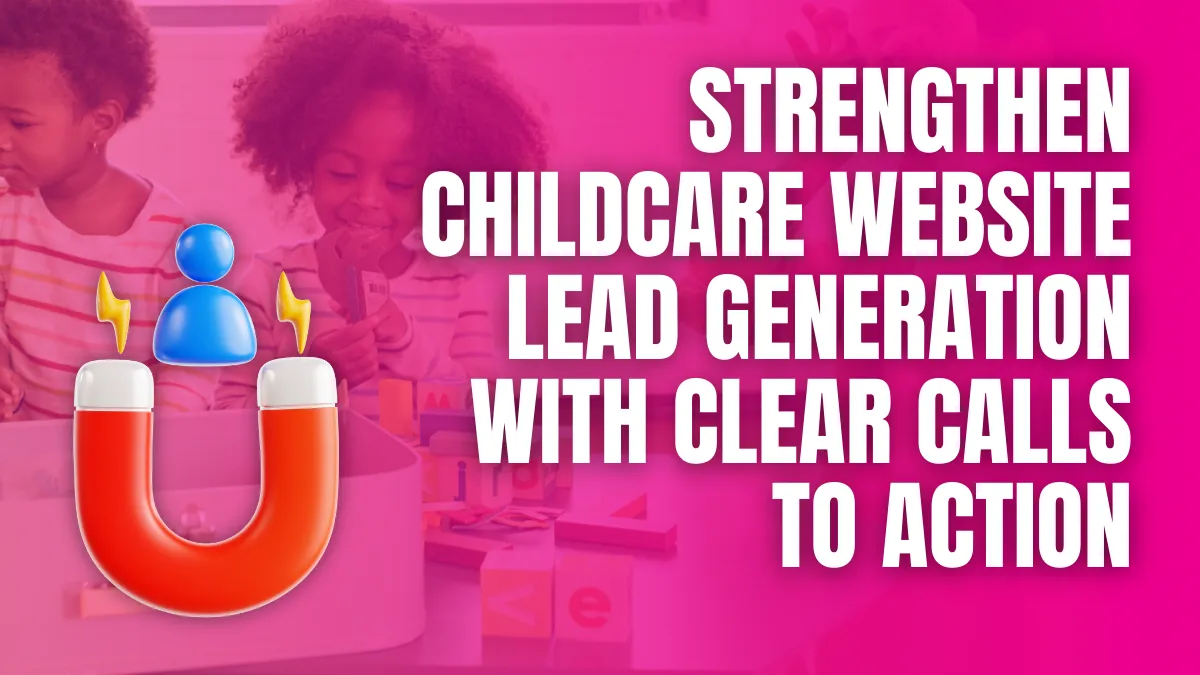
Clear calls to action are central to effective lead generation on childcare websites. Parents should never have to guess what to do next. Every key page needs a visible, specific action that guides families from interest to inquiry, tour, or enrollment.
Make The Next Step Obvious On Every Page
Each page should have a single primary action that supports your enrollment goals. Common primary calls to action include:
- “Schedule a Tour”
- “Request Enrollment Information”
- “Check Current Openings”
- “Join the Waitlist”
Place your main button near the top of the page, then repeat it in logical sections further down. This ensures that parents who scroll for more information still have an easy way to act once they are ready.
Match Calls To Action With Parent Intent
Not every visitor is ready to enroll immediately. Align your calls to action with where parents are in their decision process. For example:
- Program pages can highlight “Schedule a Tour” or “Ask About This Classroom.”
- Blog posts or resource pages can feature “Download Our Parent Guide” or “Get More Information.”
- Location pages can focus on “Contact This Campus” or “Book a Visit.”
By matching the call to action to the level of commitment a parent is likely to take, you reduce friction and increase response rates.
Use a Button Design That Draws Attention
Buttons should be easy to find and easy to click. Best practices include:
- A contrasting button that stands out from the background
- Short, action-oriented text in sentence case
- Generous padding for easy tapping on mobile
- Placement with enough white space to avoid visual clutter
Avoid using text links alone for key actions. Buttons signal importance and help guide the eye.
Connect Calls To Action With Fast Follow-Up
A strong call to action is only effective when it leads to a clear and reliable follow-up process. Ensure that:
- Forms are brief and focused
- Confirmation messages appear immediately
- Automated emails or texts acknowledge the inquiry
- Staff receive notifications to respond within a defined timeframe
When calls to action are clear, relevant, visually strong, and supported by prompt follow-up, childcare websites convert more visitors into qualified leads and future enrollments.
Use Trust Signals To Reassure Parents And Reduce Hesitation
Parents decide with both facts and feelings. Even a well-designed childcare website will struggle to convert if families do not feel confident in your safety, professionalism, and reputation. Strong trust signals help parents move from uncertainty to taking action.
Highlight Social Proof Parents Can Relate To
Social proof shows that other families have chosen and trusted your center. Effective elements include:
- Short parent testimonials with names and child ages
- Review snippets from Google or Facebook with star ratings
- Simple case examples such as “From Waitlist To Pre K Success.”
Place these near key calls to action on program and tour pages so parents see real experiences at the moment they are deciding whether to inquire.
Showcase Credentials, Safety Standards, And Experience
Parents want reassurance that your center is safe, licensed, and well-managed. Make it easy to find:
- Licensing details and accreditation logos
- Staff qualifications, training hours, and background check policies
- Clear references to safety procedures, secure entry, and classroom ratios
Icons or short bullet lists work well and keep this information easy to scan on mobile.
Use Authentic Visuals And Clear Policies
High-quality, authentic photos of classrooms, teachers, and children engaged in daily routines help parents picture their own child in your environment. Avoid stock images whenever possible.
Support these visuals with accessible policies on topics such as communication, illness, and pick-up procedures. When parents can see both the environment and the expectations, they feel more prepared and more comfortable submitting an inquiry or booking a tour.
Conclusion
Effective childcare website conversion optimization turns your site from a digital brochure into a predictable source of inquiries, tours, and enrollments. When landing pages are focused on a single goal, inquiry forms are parent-friendly and straightforward, calls to action are clear, and trust signals are visible throughout, families can move confidently from browsing to taking the next step. Layering in mobile-friendly design and ongoing testing of key elements ensures that your website continues to perform as user expectations and behavior evolve.
If you are ready to turn more website visits into real enrollment opportunities, contact No Joke Childcare at 706-303-3012 or visit https://localchildcaremarketing.com/contact-no-joke-childcare/.
[/fusion_text][/fusion_builder_column][/fusion_builder_row][/fusion_builder_container]